
The one where we took our packaging game to the Max!
Max Protein Launch
Objective:
Giving one of India's oldest protein brands, Max Protein, a spanking new look - right from packaging design to creatively transforming the entire look of the brand.
Insight
While Max Protein dominated the health and wellness market as one of the oldest players in the protein game, the market itself had changed. Young India needed clean labels, less fluff and a more contemporary approach when it came to branding and packaging. That meant only one thing for our branding team - months of sleepless nights, excessive caffeine intake and a brilliant new brand persona built from the ground up at Ting.
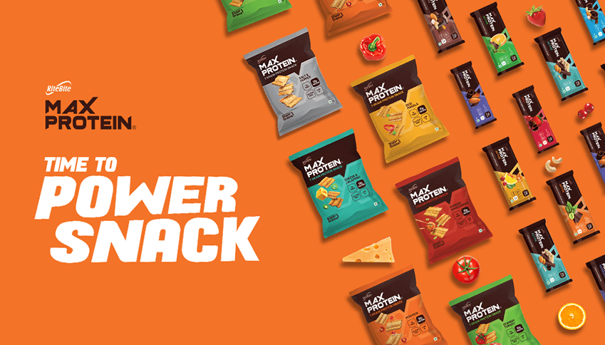
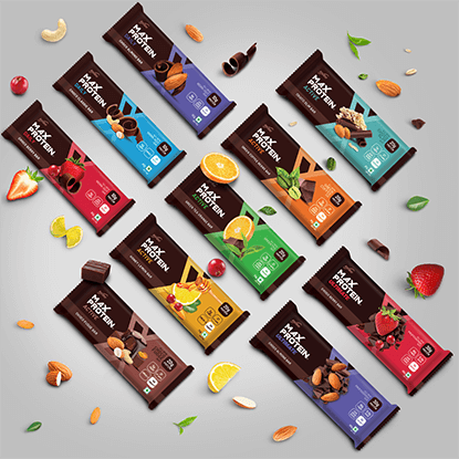
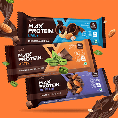
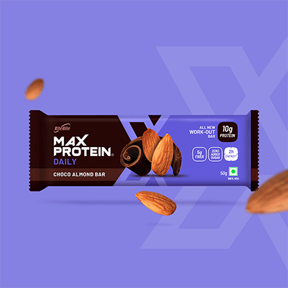
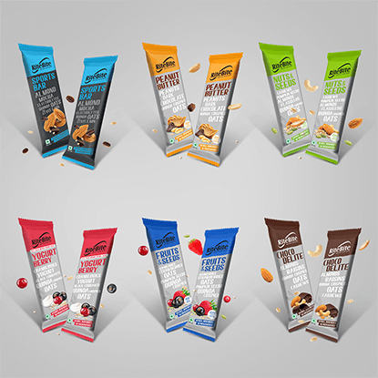
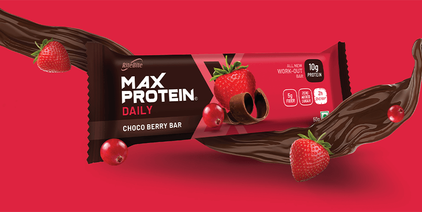
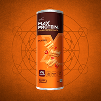
Always judge a bar by its cover
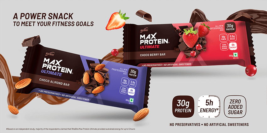
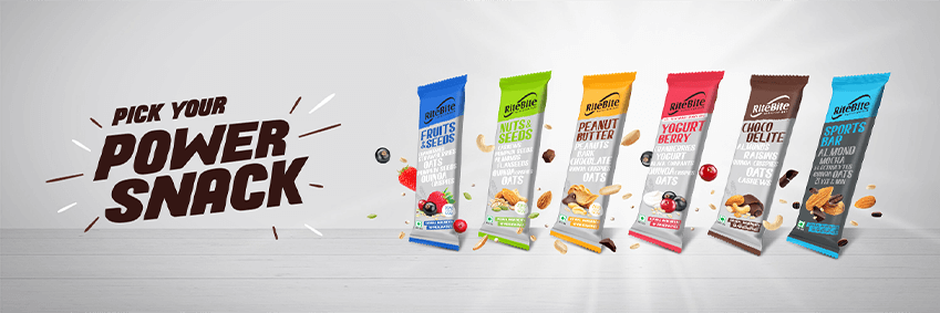
When it comes to a brand like Max Protein, first impressions are everything. Our first order of business involved moving away from the deliberate machismo of the original packaging to a new design that was exciting, innovative, clean and above all, would appeal to women and young millenials as well. We ended up designing over 60 packaging units and thereby, completely overhauling the look of the products through our creative packaging designs.
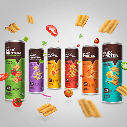
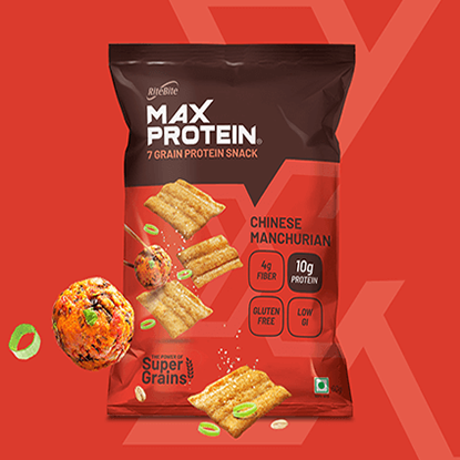
Making chips great again
Chips that are packed with proteins and are actually good for you? After stuffing our faces and filling our tummies, we extended the new, refreshed brand style to Max Protein Chips as well and designed all the packaging for it too.
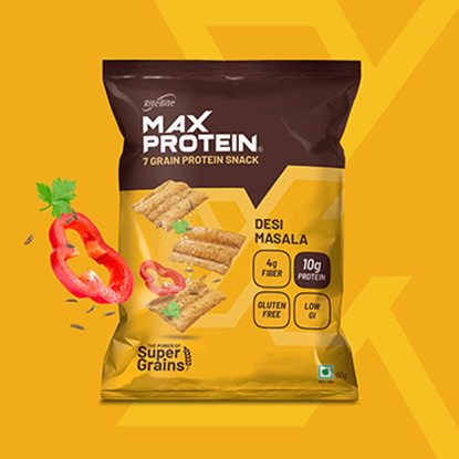
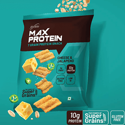
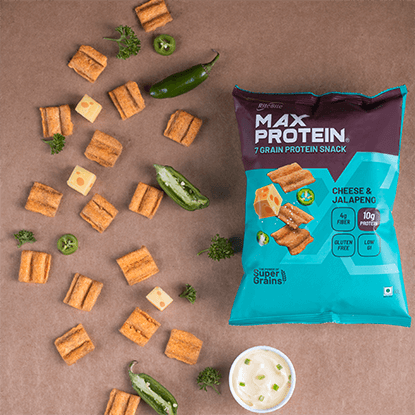
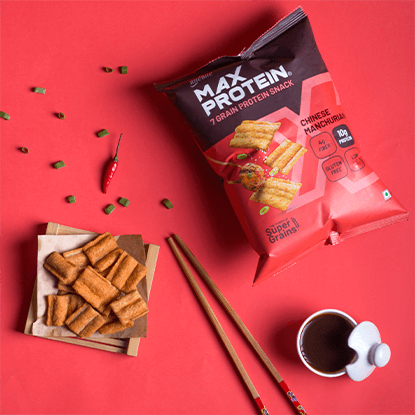
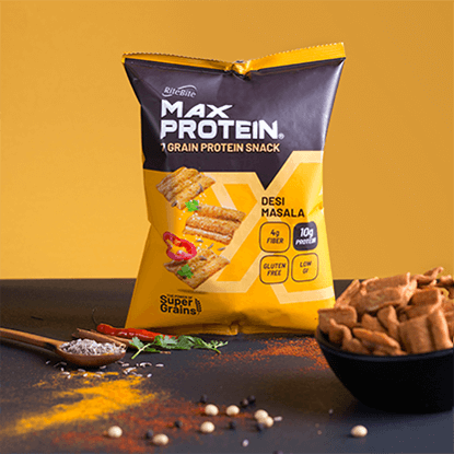
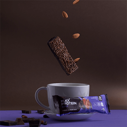
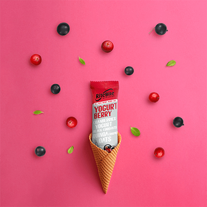
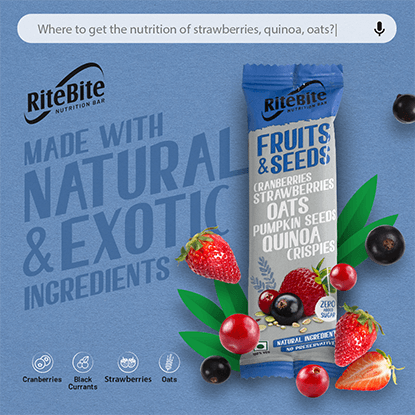
Say Cheese Quinoa Crispies!
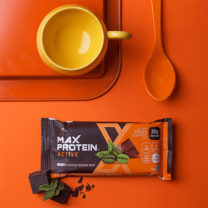
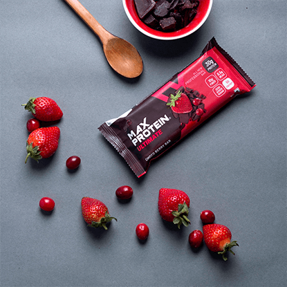
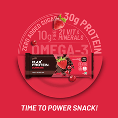
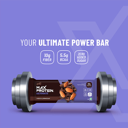
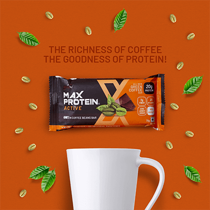
What's the point of great product packaging design if you can't show it off as well? Which is why we got our in-house photography team to fire up their cameras and capture some lush flatlays, product shots, action shots and whatnot.
Gettin' creative
Yep, we went the whole nine yards with a range of different ATL, BTL and digital creatives in addition to transforming their website too. Phew.
Result?
Those who witnessed the Grand Parade were left awestruck. With over 15 global iconic characters, non-stop entertainment, and a never-tiring enthusiastic crowd, it was truly the GRANDEST Toy Parade the country had ever seen.